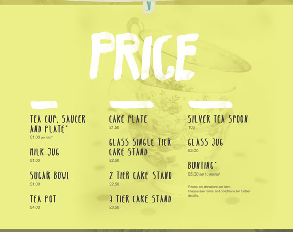
We are always talking about clean and minimal designs, designs that are simple and effective, and lately, we are also talking a lot about the new trendy flat designs. So why it is so difficult to find a “pricing page” that is well designed? If designers are taking websites to a next level where usability and beauty are combined to deliver awesomeness, why when you go from a homepage to a pricing page you feel like you are entering a totally different website? Designers should pay more attention to this specific page, specially if they want better conversion rates.
It doesn’t matter if you are developing a website for a restaurant, a service provider or something else that may require periodical payments, you need to put a lot thought into the pricing portion of the site. First of all, you want to show the pricing menu in a clear way so that users don’t need to search for it. Second, if the homepage looks amazing, do the same with the pricing page so it’s obvious to the user that you care about your product. Third, remember to be clear and provide the important information your users need to know. Avoid small letters and confusing data.
I have to admit it was hard to gather the examples we will show here. I had to go through a lot of websites to find nice enough designs to show you, so I hope you enjoy the selection and I hope you use these examples as inspiration for your next project. And if you have an example to share, please share in the comments.


This collection of “21 Examples of Pricing Pages in Web Design” is a fantastic resource! The diverse examples provide great inspiration for designing effective and engaging pricing pages. Thanks for sharing these insights!
Thank you.