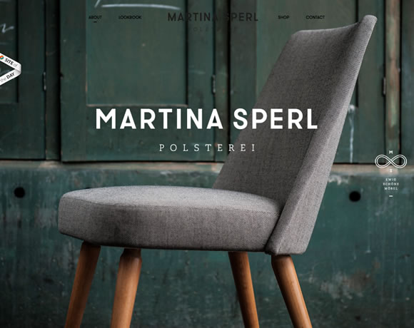
Using big photographs in a web design, either as the background or part of the content, is a great way to easily set the overall mood of a site. However, when doing this, you run the risk of creating a site that it visually too busy. That’s why most site’s that you see making use of big images have an overall minimal style when it comes to the other design elements. For today’s inspiration, we’ve gathered a collection of sites that are excellent examples of how to use big photography in a web design.
Related Posts
tags
3d ads after effects after effects project ai app art christmas clean design eps facebook flat font fonts free icons illustrations imac infographic inspiration iPad iphone logo macbook minimal mockup pattern photography photo manipulation photoshop premium psd responsive template texture theme typography UI vector video vintage web design websites wordpress
Privacy & Cookies: This site uses cookies. By continuing to use this website, you agree to their use.
To find out more, including how to control cookies, see here: Cookie Policy
Recent Posts
Friends
Terms of use
We are not distributing files. We can't give you permission to use any resource you found on yourdesignmagazine.com
Always check source website from blog posts and make sure you read their terms and conditions.