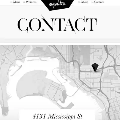
A website should have a clear an obvious way for visitors to get in touch with the site’s owner. This is normally done with a contact page. It doesn’t mater if you are a designer, creative studio, shop or anything else, it is important that your audience can easily find how to get in touch with you. And of course it is even nicer if your audience can find a contact page/form that shows your personality – something that shows that you care about your viewers and that you want them to contact you. To show you how to approach the “contact page” we gathered nice examples, showing that from super clean options to colorful ones, from minimal footers to complete drop down forms and maps, there is always a a creative approach you can take when designing a contact page.
Related Posts
tags
3d ads after effects after effects project ai app art christmas clean design eps facebook flat font fonts free icons illustrations imac infographic inspiration iPad iphone logo macbook minimal mockup pattern photography photo manipulation photoshop premium psd responsive template texture theme typography UI vector video vintage web design websites wordpress
Privacy & Cookies: This site uses cookies. By continuing to use this website, you agree to their use.
To find out more, including how to control cookies, see here: Cookie Policy
Recent Posts
Friends
Terms of use
We are not distributing files. We can't give you permission to use any resource you found on yourdesignmagazine.com
Always check source website from blog posts and make sure you read their terms and conditions.